Tue 13 May 2025:
Google has officially announced an update to its iconic “G” icon after nearly 10 years.
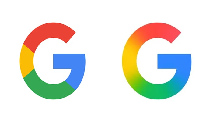
Alphabet-owned Google revealed on Monday, May 12, 2025, that it is now updating the icon so that there are no longer four solid colour sections.
To note, red bleeds into yellow, yellow into green, and green into blue.
It will look more vibrant and colourful, and this modernisation feels inline with the Gemini gradient, while AI Mode in Search uses something similar for a shortcut.
__________________________________________________________________________

https://whatsapp.com/channel/0029VaAtNxX8fewmiFmN7N22
__________________________________________________________________________
Back on September 1, 2015, Google undertook a significant brand refresh, most notably updating its full “Google” logotype to the custom-designed, modern typeface we now know as Product Sans. As part of that overhaul, the accompanying ‘G’ icon also transformed. The previous lowercase white ‘g’ set against a blue background was retired in favor of the circular, four-color uppercase ‘G’ that has been a staple for the past ten years.
The latest iteration of the ‘G’ icon sheds the clearly separated color sections, and now the red bleeds into the yellow, into green, and lastly into blue. The overall effect is a more dynamic and colorful appearance that aligns visually a bit more with the gradient aesthetic seen in Google’s Gemini branding, along with the shortcut for AI Mode in Search.
Currently, the new icon is already in use by the Google Search app for iOS. However, Android users are expected to view this new icon soon. It’s a subtle change that you might not immediately notice, especially if the main place you see it is on your home screen.
It does not appear that Google is refreshing its main six-letter logo today, while it’s unclear whether any other product logos are changing. To note, some of the company’s four-colour logos, like Chrome or Maps, could pretty easily start bleeding in their sections.
SOURCE: INDEPENDENT PRESS AND NEWS AGENCIES
__________________________________________________________________________
FOLLOW INDEPENDENT PRESS:
WhatsApp CHANNEL
https://whatsapp.com/channel/0029VaAtNxX8fewmiFmN7N22
![]()
TWITTER (CLICK HERE)
https://twitter.com/IpIndependent
![]()
FACEBOOK (CLICK HERE)
https://web.facebook.com/ipindependent
![]()
YOUTUBE (CLICK HERE)
https://www.youtube.com/@ipindependent
![]()
Think your friends would be interested? Share this story!