
Wed 27 July 2022:
The Play Store, a part of tech giant Google, has now received a new logo to commemorate its tenth anniversary.
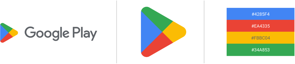
The tech giant has made a few minor adjustments to the general design of the Google Play Store logo, but the most noticeable modifications are the less vibrant colors that more closely resemble the green, yellow, blue, and red hues that Google uses for many of its other services.
According to The Verge, it is a subtle change that also goes well with the new Chrome logo that was updated earlier this year.
“We are introducing a new logo that better reflects the magic of Google and matches the branding shared by many of our helpful products — Search, Assistant, Photos, Gmail and more,” Tian Lim, VP of Google Play, was quoted as saying.
The new logo and iconography also mark 10 years of Google Play after it was rebranded from the Android Market in 2012.
“A decade later, more than 2.5 billion people in over 190 countries use Google Play every month to discover apps, games and digital content,” Lim said.
“And more than 2 million developers work with us to build their businesses and reach people around the globe,” Lim added.
To commemorate the tenth anniversary of Google Play, Google is also increasing the value of Google Play Points. Users who activate the points booster will earn 10x points on all purchases, including most in-app purchases.
SOURCE: INDEPENDENT PRESS AND NEWS AGENCIES
___________________________________________________________________________________________________________________________________________
FOLLOW INDEPENDENT PRESS:
TWITTER (CLICK HERE)
https://twitter.com/IpIndependent
![]()
FACEBOOK (CLICK HERE)
https://web.facebook.com/ipindependent
![]()
Think your friends would be interested? Share this story!